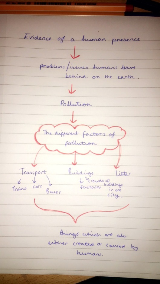
In this project I will be focusing on the problems and issues that humans leave on the earth such as pollution. I will then be looking at the opposite, capturing the beauty that humans leave behind, such as graffiti and beautiful detailed architecture. These different creations I will capture will prove the existence of human presence.
Response idea to the theme:
Problems and issues humans leave behind
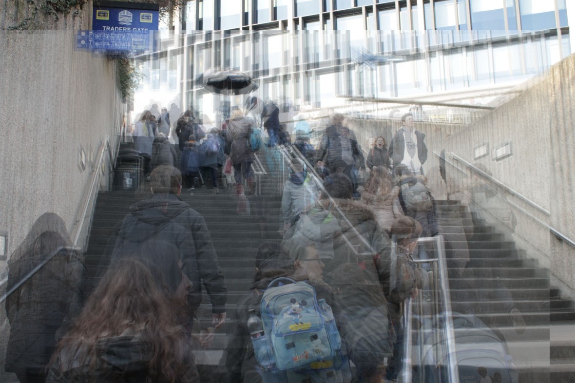
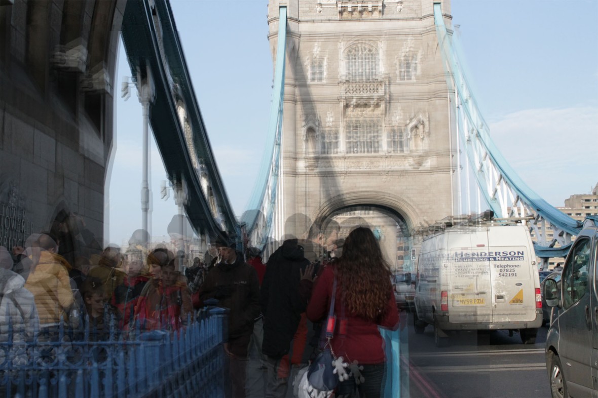
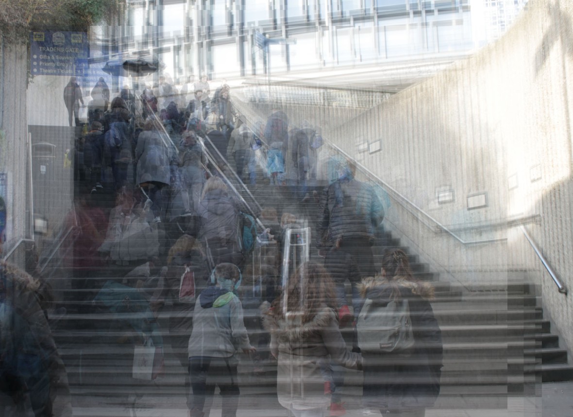
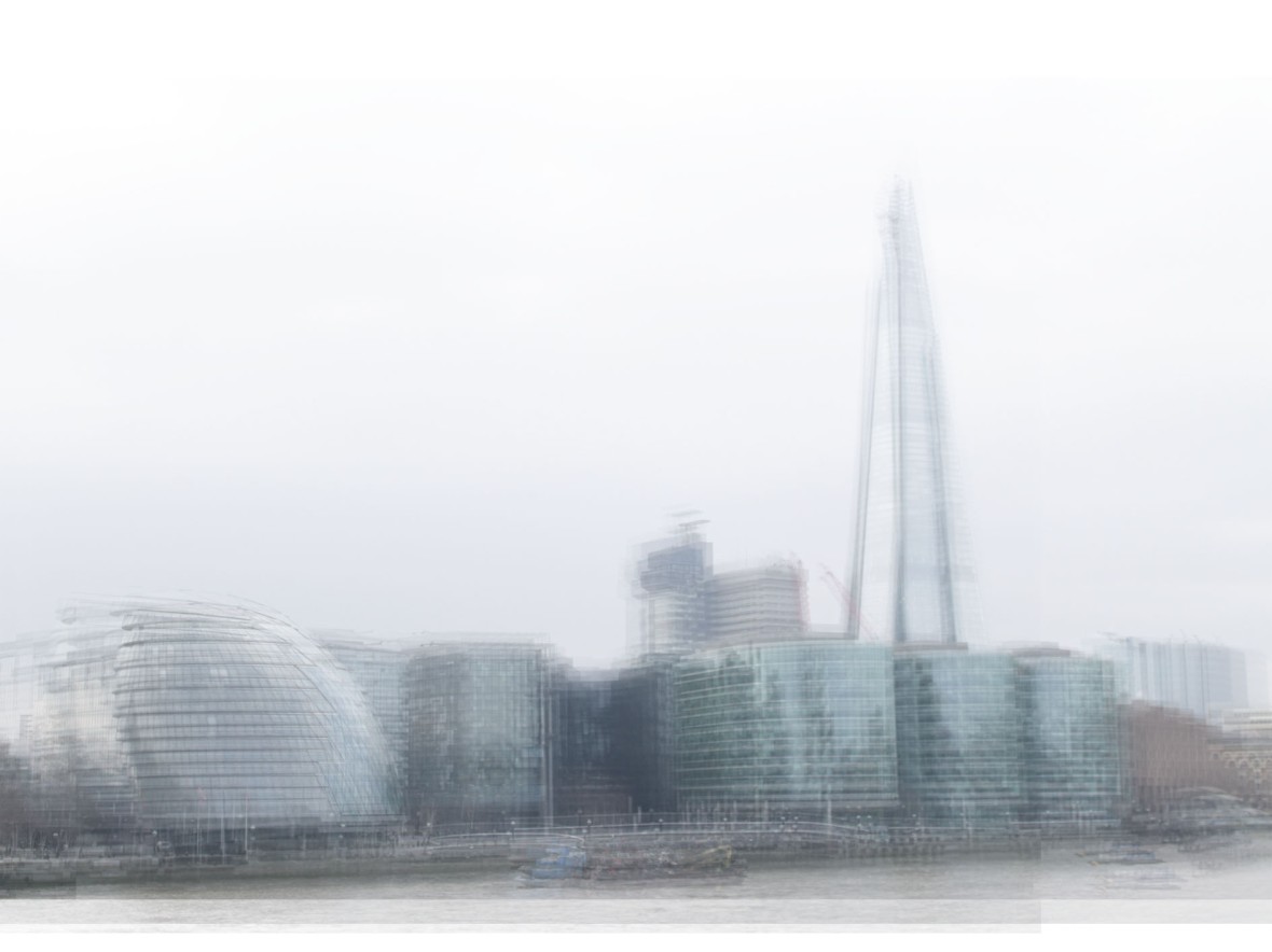
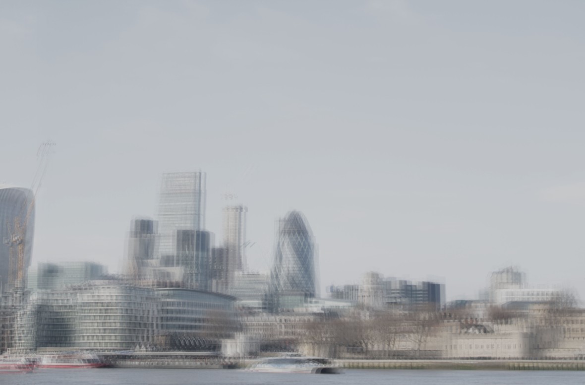
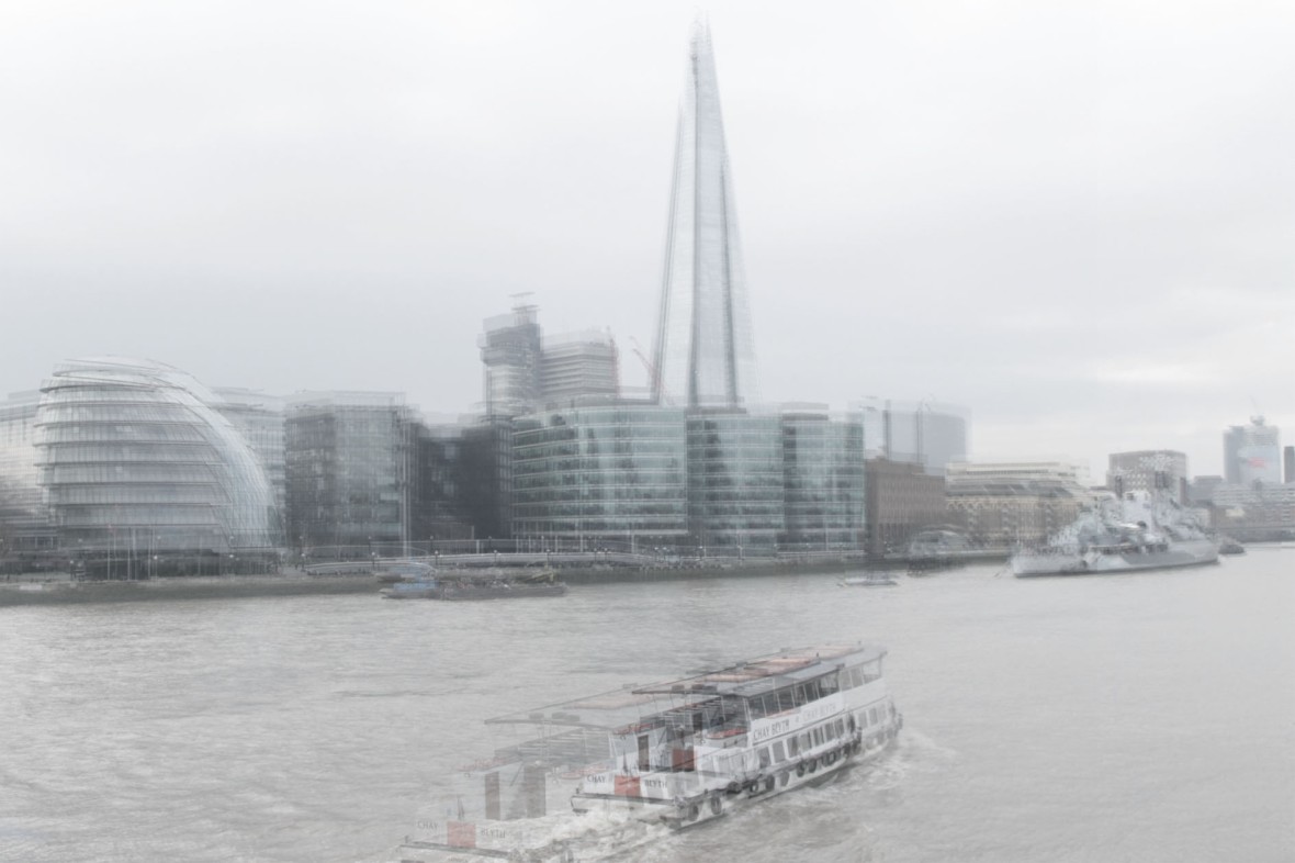
The problem and issue humans create that I will be focusing on is pollution. Pollution can be created from many things like, litter, buildings, transport. All these I have listed have been all come from humans, so therefore humans are the biggest cause of pollution. I will firstly be taking photographs of a crowd of people to represent how there are many of humans and how they are polluting the earth. After taking the images I need I will then overlay the different photographs on Photoshop to create a blur effect on the image to make it look like air pollution. I will then do the same for litter, buildings and cars.
Artist I was inspired by:
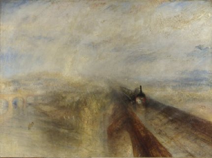
Joseph Mallord William Turner – Turner is an artist who created a painting called ‘Rain, Steam and Speed’. In this painting he created a blur effect to make the image look smokey and unclear however he kept one part of the image focused and that was the train; this was to keep the focus on the main cause (the train) and the rest blurry to show the steam and pollution coming from the train. I was inspired by his painting because as I have explained for my response I want capture the different things that cause pollution and overlay them to create a blur effect, similar to Turner’s painting.
I have focused on all the things that cause pollution. when people think of pollution they first think things like air pollution, litter, cars or buildings when really its humans, they are the ones who have created all things that cause pollution so therefore they are pollution.
PEOPLE
For the ‘people’ photographs I have also been inspired by artist Ernst Haas. He is a photographer who mainly focuses on movement and captures people or different objects moving takes pictures of movement. So therefore as my first idea I am going to create a response that combines both Haas’ and Turner’s artwork.


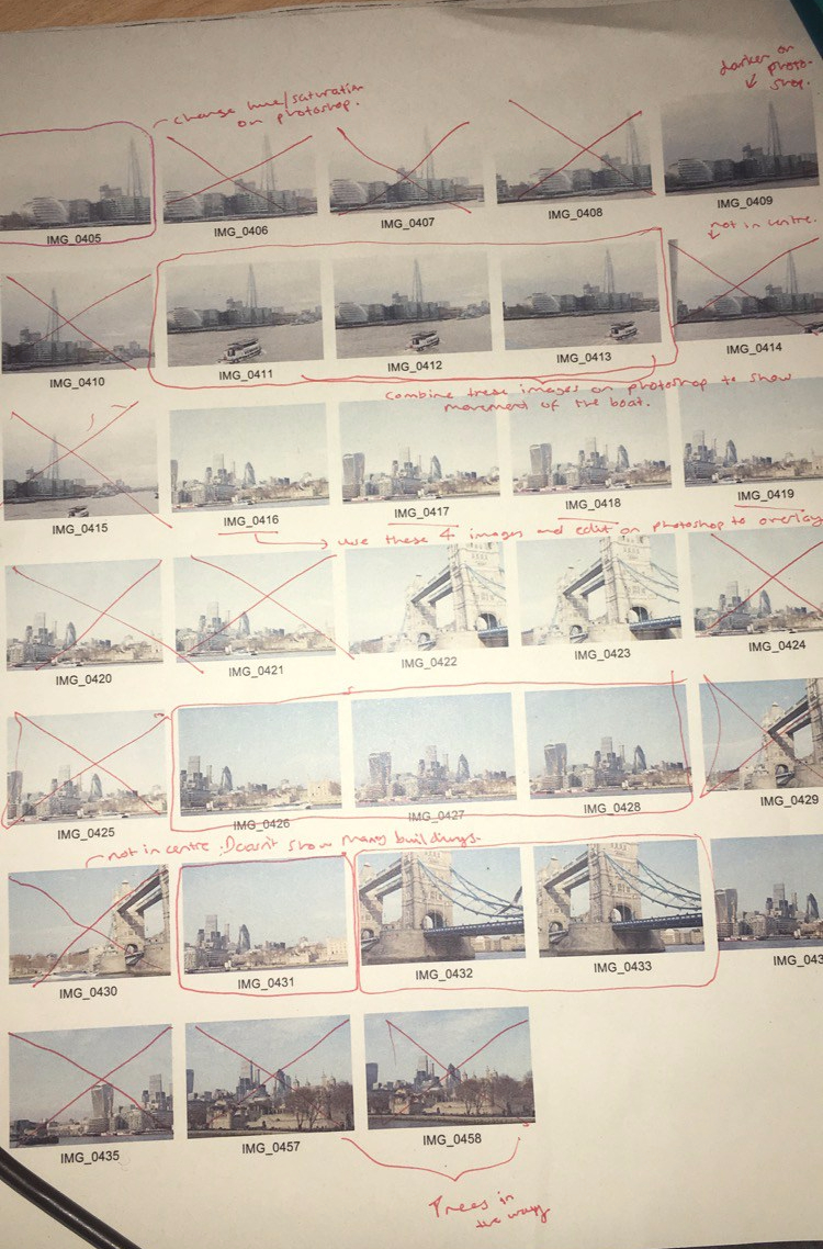
Contact sheet:
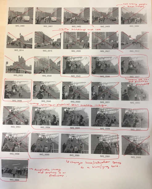
How I edited them:
Firstly I opened up the images I wanted to edit and use onto Photoshop and then I duplicated that image so I could then drag it onto the original image to overlay them. After doing this I then changed the opacity to create a blurred, faded look.
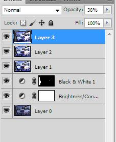
I created multiple layers to create the blur effect
My final responses:
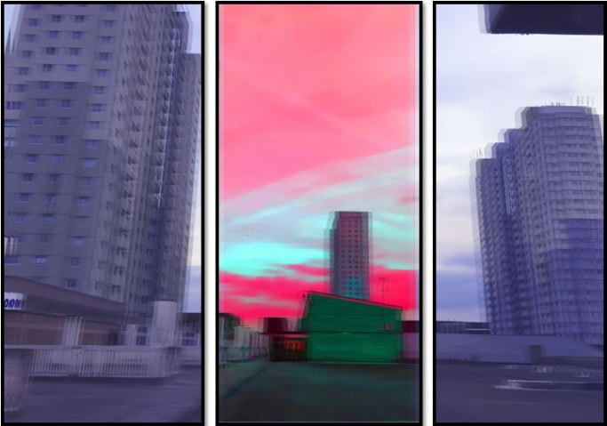
BUILDINGS
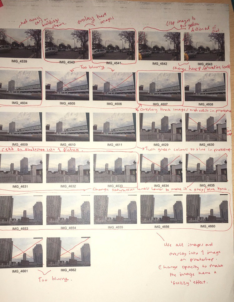
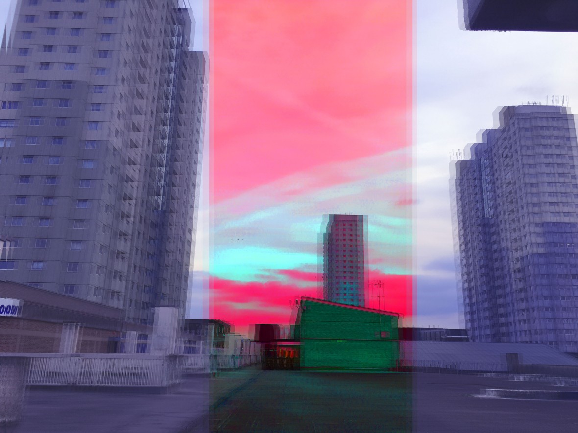
For this development of my response I will be taking photographs of lots of buildings crowded together. I will also be editing them in Photoshop by changing the saturation to a lower level; this will then create a blue/grey tone which will help represent pollution as it will make the picture look cloudy and make the people viewing it feel crowded and claustrophobic.
Contact sheet:
Final images:
Development:
Rodney Graham
Rodney Graham is a photographer who cuts up his work and separates his one image into different sections. I like this technique because it allows you to focus on all parts of the photograph instead of always just looking at the centre of one image and not focusing on the rest.
Miles Aldridge


Miles Aldridge is an artist who takes photographs and then edits them by changing them into bright coloured images. The mood of his art work is the opposite of peaceful, quiet and calm it has more of a busy, crowded as it has many different bright colours in one picture clashing together.
Pierre Huyge
Pierre Huyge is a photographer who uses a lot of tone to help create his image. In his image above he has edited the image to a blue tone to help create a dark/gloomy mood.It helps to make his piece look foggy and mysterious.
Development Idea:
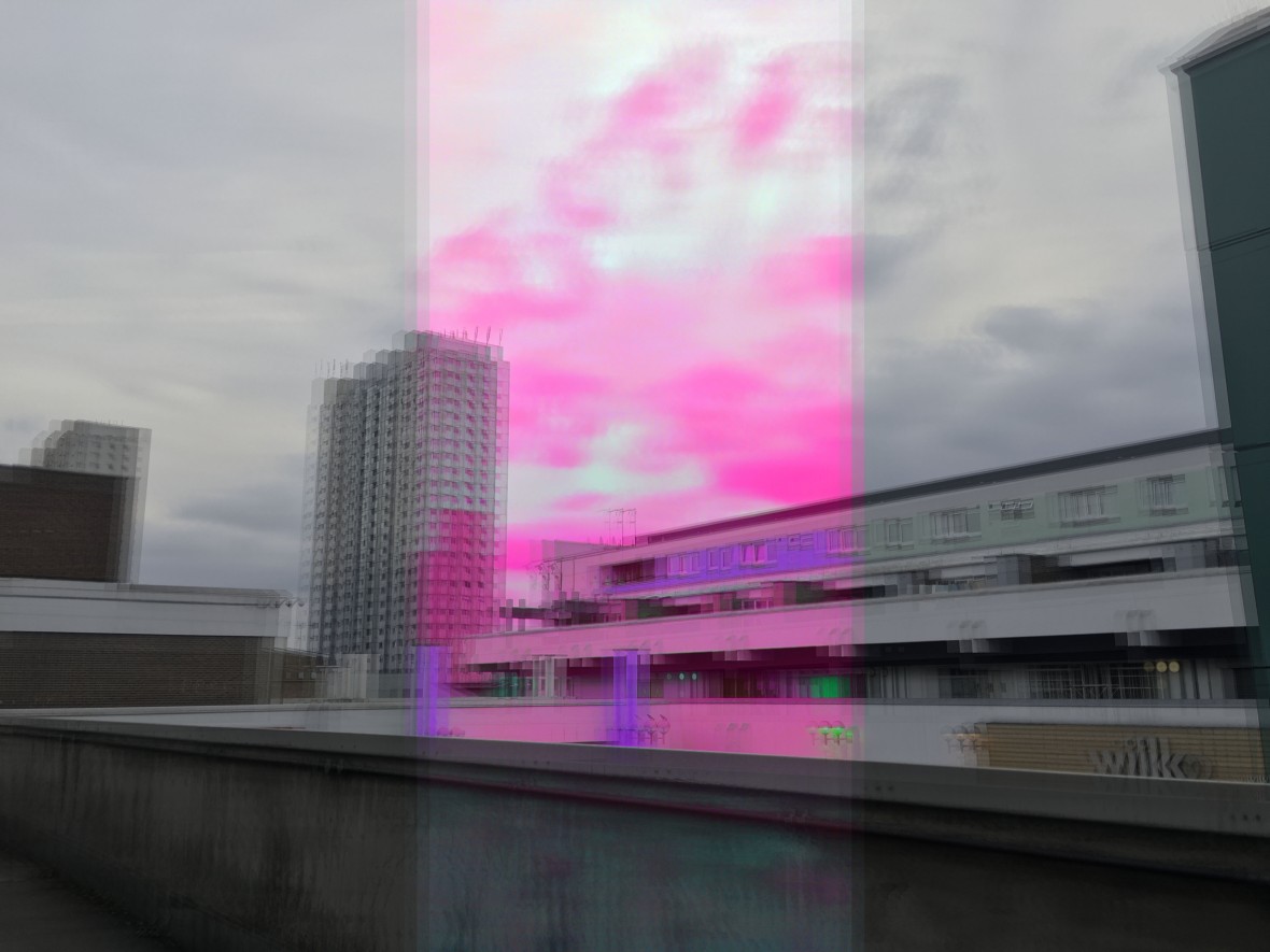
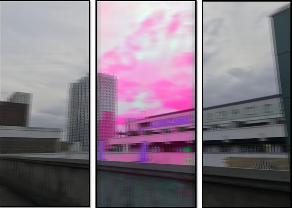
Therefore as a development I have decided to combine both techniques I have looked at from the artists I have researched above. I will be taking images of crowds of buildings, cars and people again and then be cutting up the images into different sections. In my previous work I made the tone of the image quite a significant part of my piece to help represent the meaning behind my work, and so I will be continuing that by changing the tone of the different sections of my one image; for example my first cut up piece I will be editing it in Photoshop and changing the saturation levels so that section will have a tint of blue/grey tone and make it look foggy, smokey and gloomy which will make the viewer feel crowded and claustrophobic, for this section I will be using Pierre Huyge’s work to help me. Then the next section I will be using Miles Aldridge’s work to help inspire me when I edit my image. I will be using bright, bold colours to create a busy, crowded, loud mood. Both of the tones I will be using to edit my images will help to present the meaning of pollution.
Contact sheet:
How I edited them:
The process of editing these images was quite difficult. Firstly I opened up the image into Photoshop and then cropped it into three sections by using the crop tool. I then saved each section into a different file. For each section I then changed the tone and colour of it in the way I wanted it to be; the outer sections I edited them into a blue/grey tone by changing the saturation levels. Then for the middle section I changed the colour to more vibrant and bright colours. After completing that I then had to copy and paste the sections into one file and fix it back together and then I had to paste the one image file again and again on top of each other to overlay all the images so they can become quite blurry.
Final images:
Evaluation
Overall I am happy with the outcome because I think that from the way I planned it it has come out really well in the way it represents my meaning of colour and different tones being able to present different moods and feelings such as the outer sections which are blue/grey tones create a cloudy and almost claustrophobic feel as it and the middle section is more presenting a bright, and busy mood as the colours are clashing and it looks the opposite to peaceful and calm.
Linking it back to the theme these colours help the buildings in these images to look blurry, busy and polluted just the way buildings are a big factor to pollution which is an issue caused by humans but it is not much spoken about or seen because in real life without these edits they just look like normal buildings and no one really knows what harm these buildings have caused to the environment.
Sigmar Polke
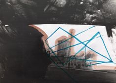
As I was researching different artists I came across a photograph that was taken by Sigmar Polke. But what I liked about his piece was that it stood out the most because of the different techniques he used such as different tones of lighting, bright colours painted on his own photograph to make the centre section stand out. He also had a clear outline of somebody’s shadow of their face included in the photograph; this made me think of ways I could do a response as it links perfectly from my last responses because it includes buildings, different tones of colour to help represent different meanings and shadows of people.
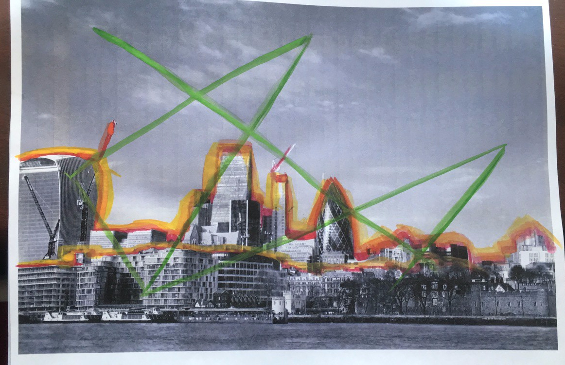
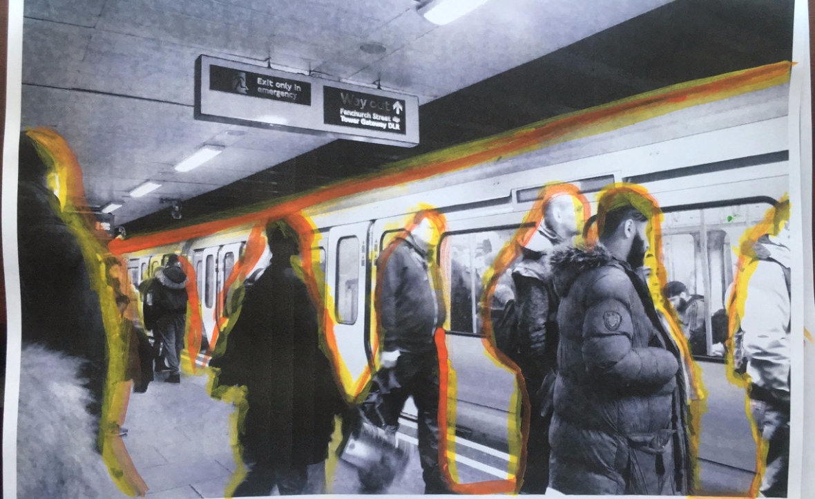
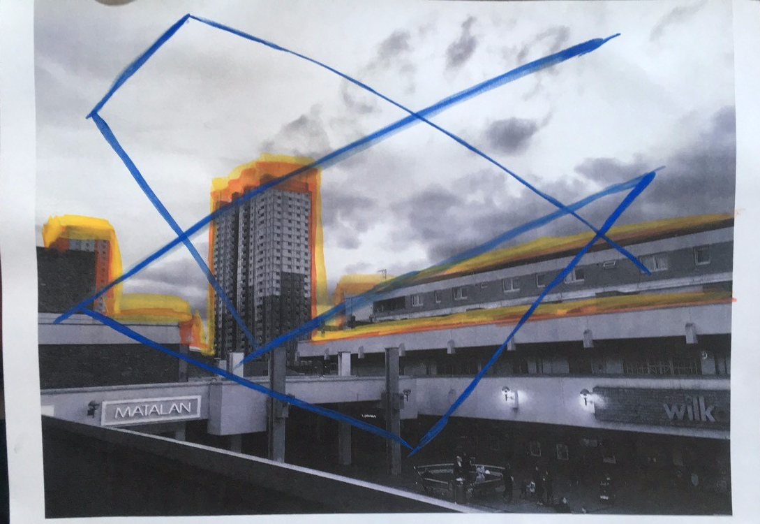
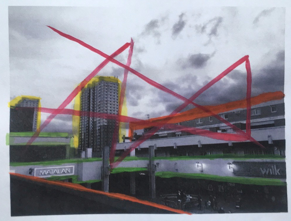
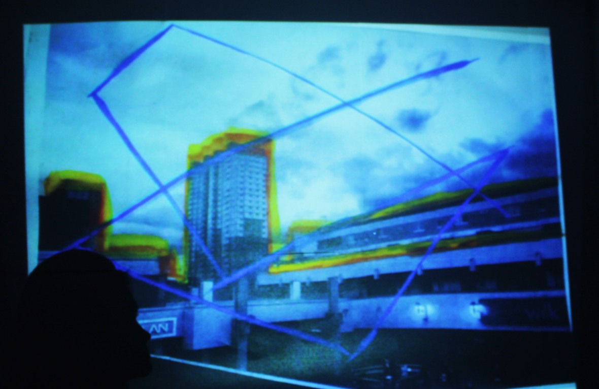
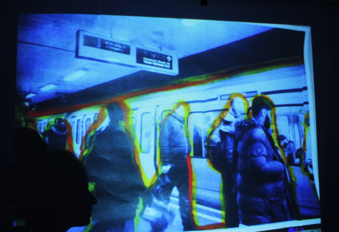
Response idea: As a development I have looked at Sigmar Polke’s work and decided to research where is the most polluted area in London and when I did most sources stated that in central London, the buildings near the London bridge is a highly air polluted area. So I then went there to take images and also other places. After I edited them in Photoshop to black and white tones and then used bright colours to paint and highlight around the buildings and people to help show and highlight what are the main contributions and factors of pollution. I made it similar to Polke’s work by adding random lines across the page to also create a ‘busy’ ‘crowded’ and ‘claustrophobic’ feel – which are the different things that pollution makes people feel even though sometimes it cannot be seen which is why I painted it on to show it is everywhere even though sometimes it may not be visible and that it is a problem caused by humans.
Final responses:
Evaluation:
As a development to my last work the meanings are still very similar as I am still using colour in my photographs to help present my meaning that links to this theme which is issues that humans leave behind which is pollution and humans create buildings which are a big factor and contribute a lot to pollution and so therefore buildings and different factors of pollution such as trains are an evidence of human presence. So in these images I have been inspired by Sigmar Polke’s technique of painting onto his own photographs by using bright, bold and busy colours to paint over my images of different buildings and areas that are filled with pollution to outline those areas and painted all over the image to create a crowded and claustrophobic feel which is what pollution in real life makes people feel. Also throughout this project I have researched that London is one of the most polluted cities and so that’s why for one of my final images I have taken images of famous buildings in London and used them as I think that those buildings truly represent London.
Studio Photography
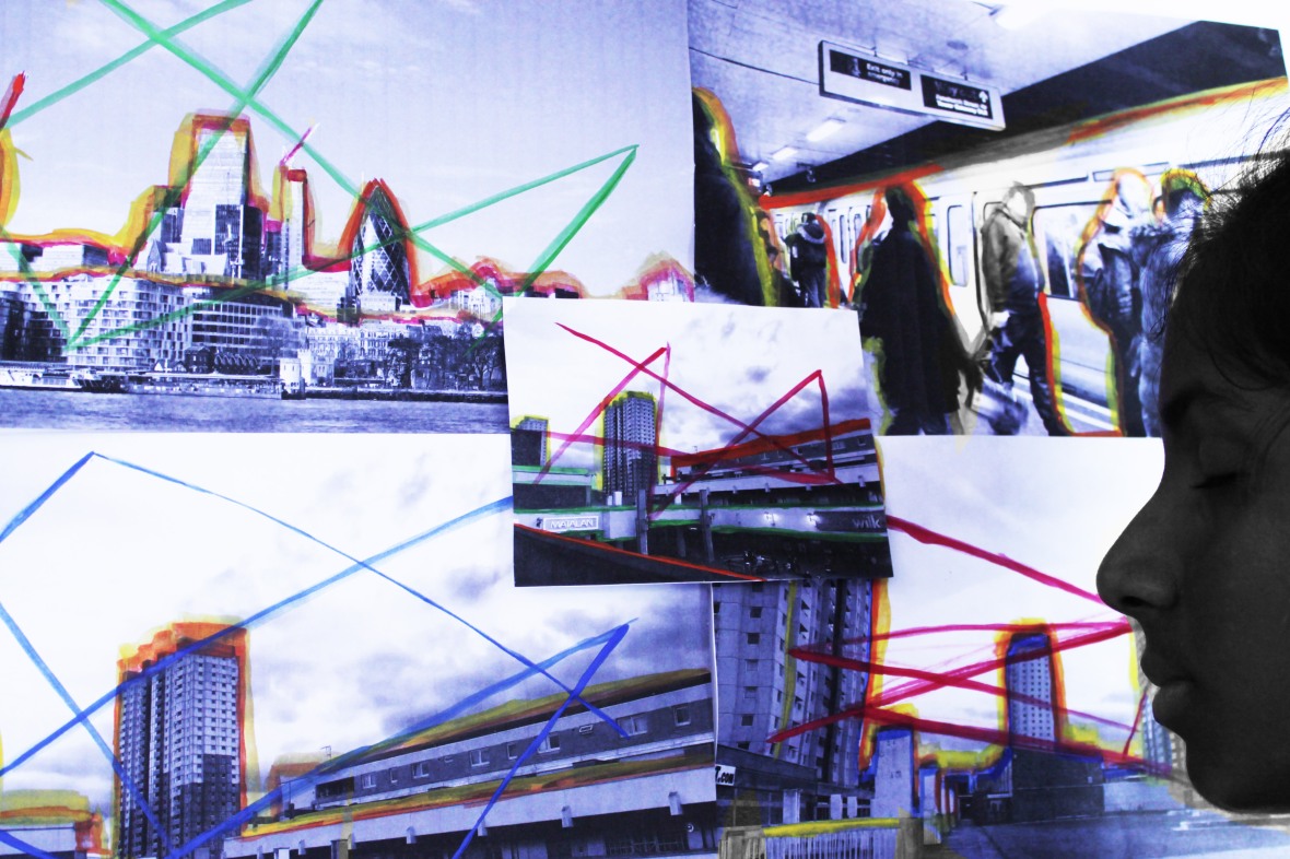
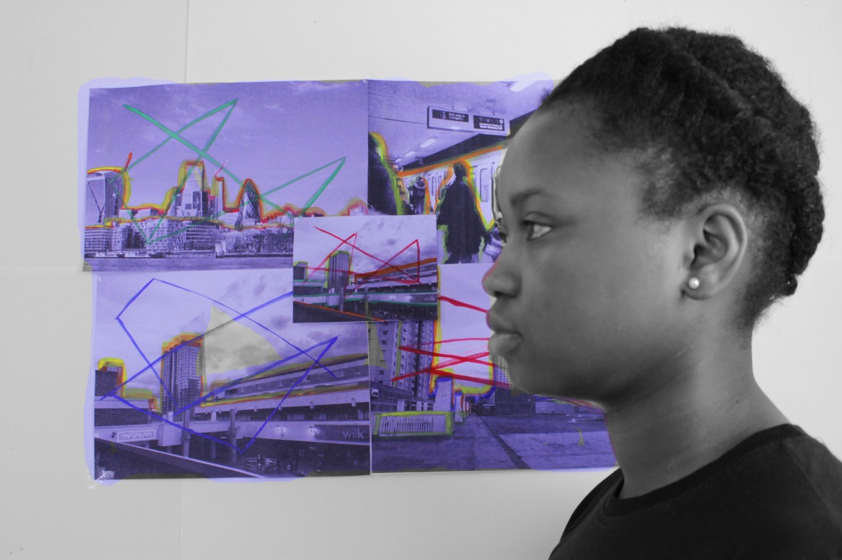
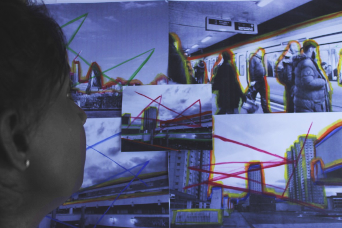
As further development I will doing a studio shoot using a collage of all my painted images and then will have someones face in front of the images similarly to how Sigmar Polke took his images. As a development I will then edit the photographs on Photoshop; I will be editing them by using he same technique that I did with my very first response to this theme which was he overlaying images. I will do this to make the images look blurry. Before doing that I will use the colour splash technique to make the face have a black and white tone but then the images in the background will be bright and the colours will stand out.
Contact sheet:
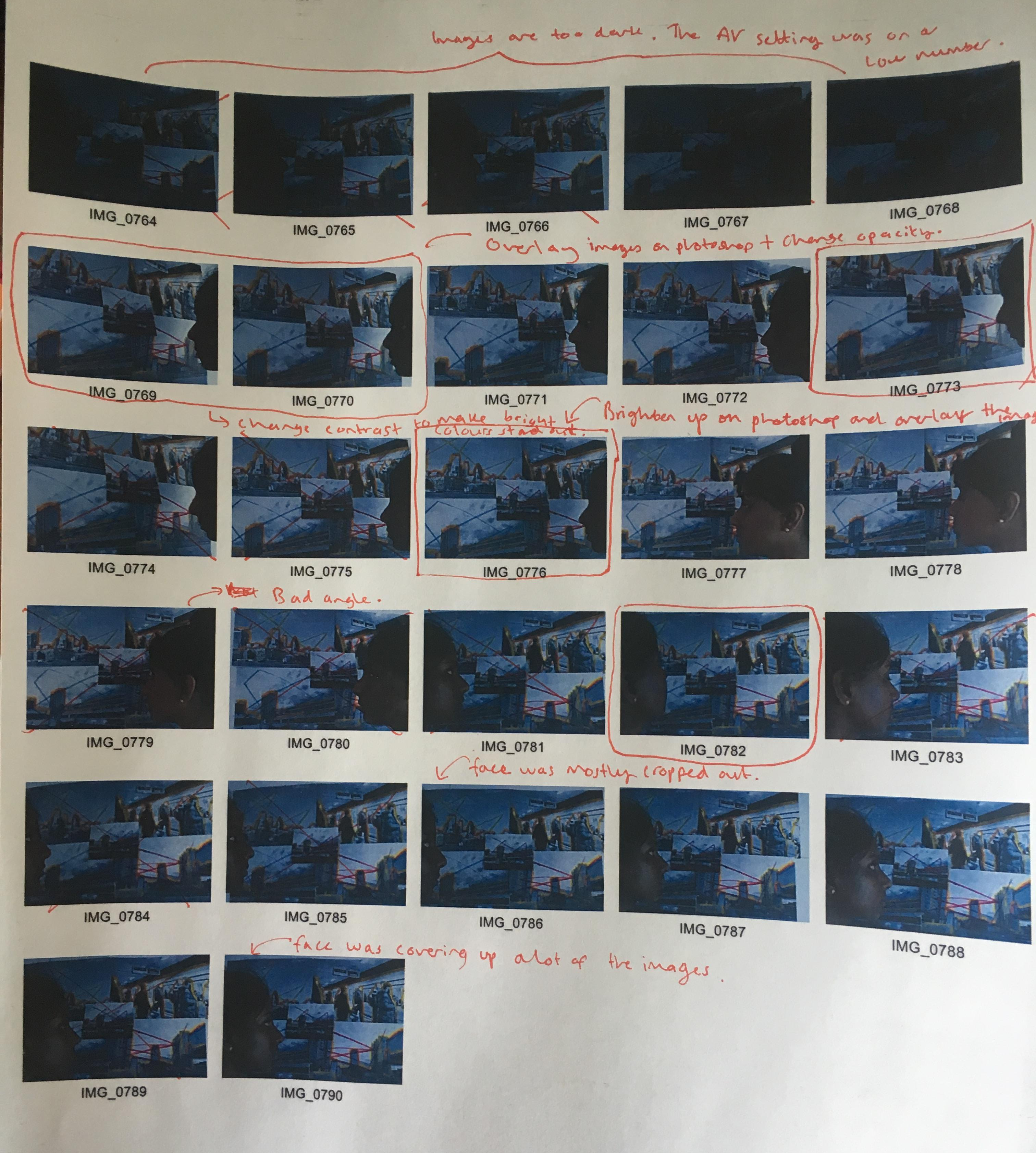
When editing this contact sheet I realised that the most common problem I had with my images were that they were too dark because I had the AV setting on a low number and so most of them you couldn’t see the face or colours clearly, and so then the colours didn’t stand out as much as I wanted them to.
Final images:
Screenshots of how I edited my images:
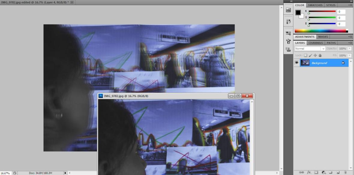
I opened up another image so I could then drag it onto the orignal image to overlay them and change the opacity to create a blurred, faded look
I created multiple layers to create the blur effect
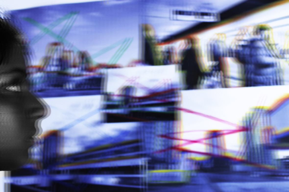
Final edited images:
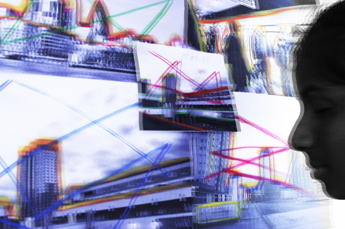
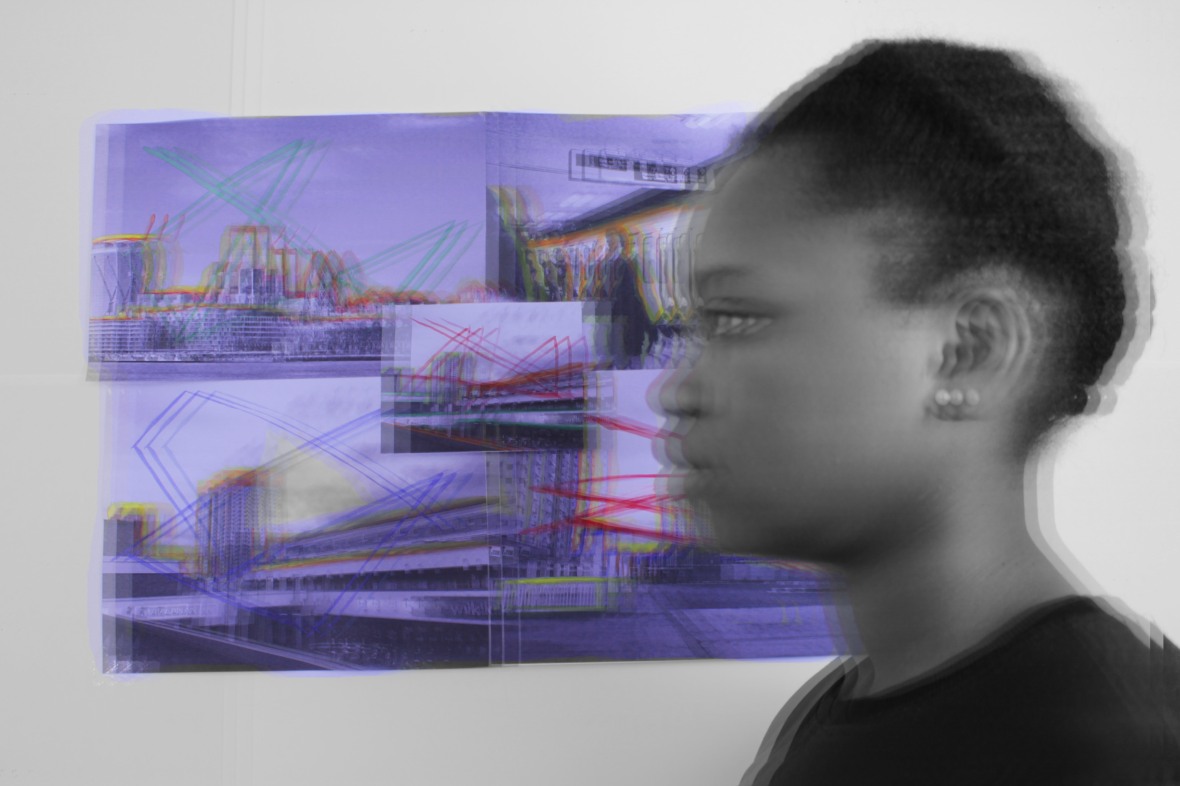
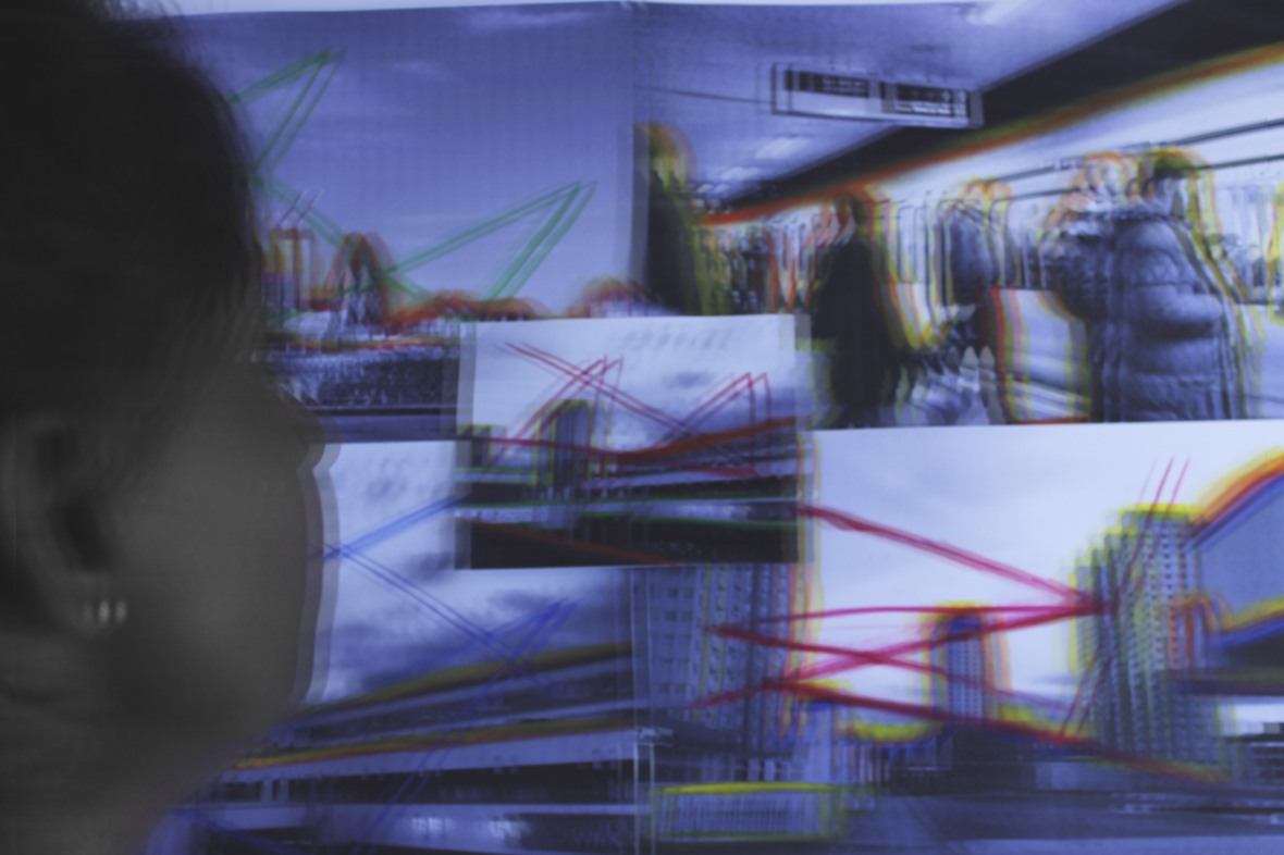
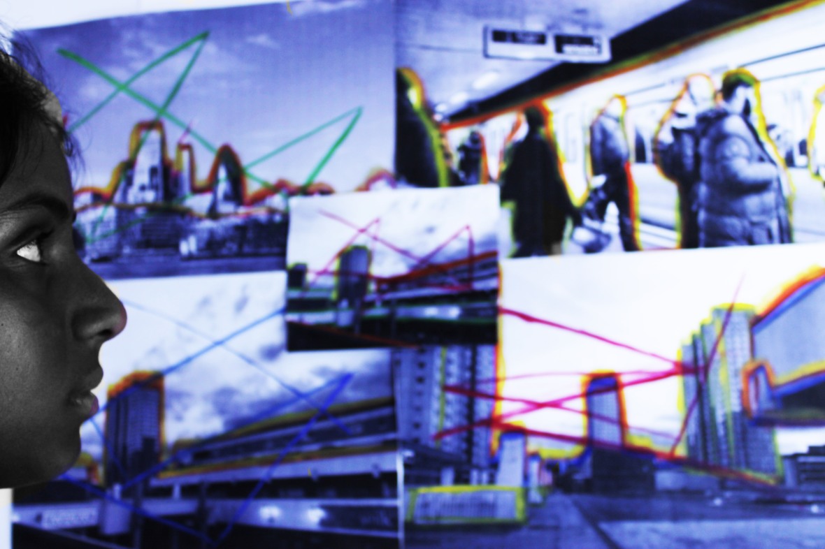
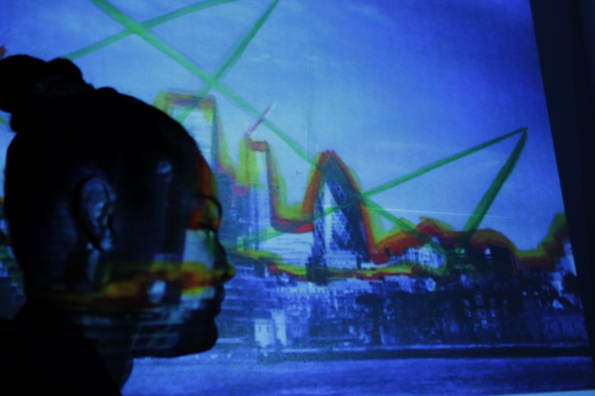
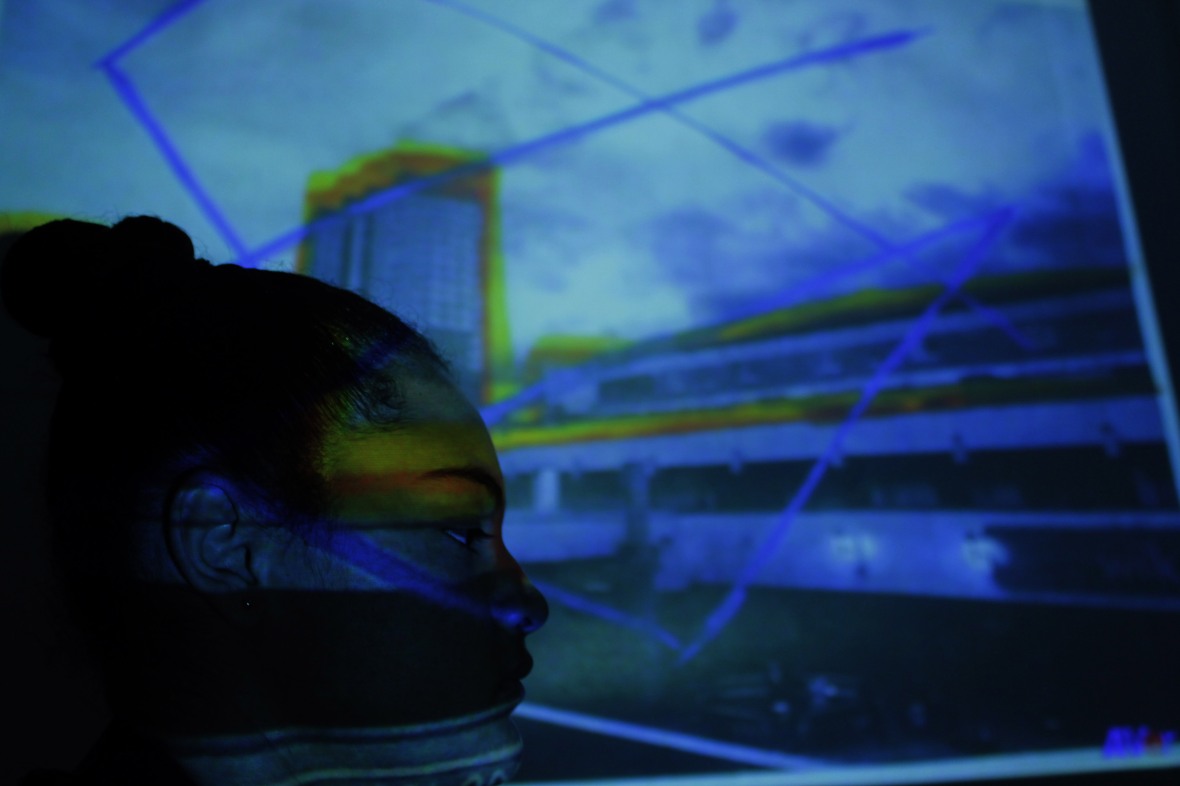
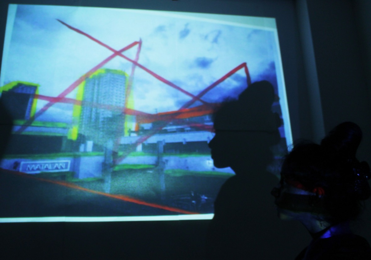
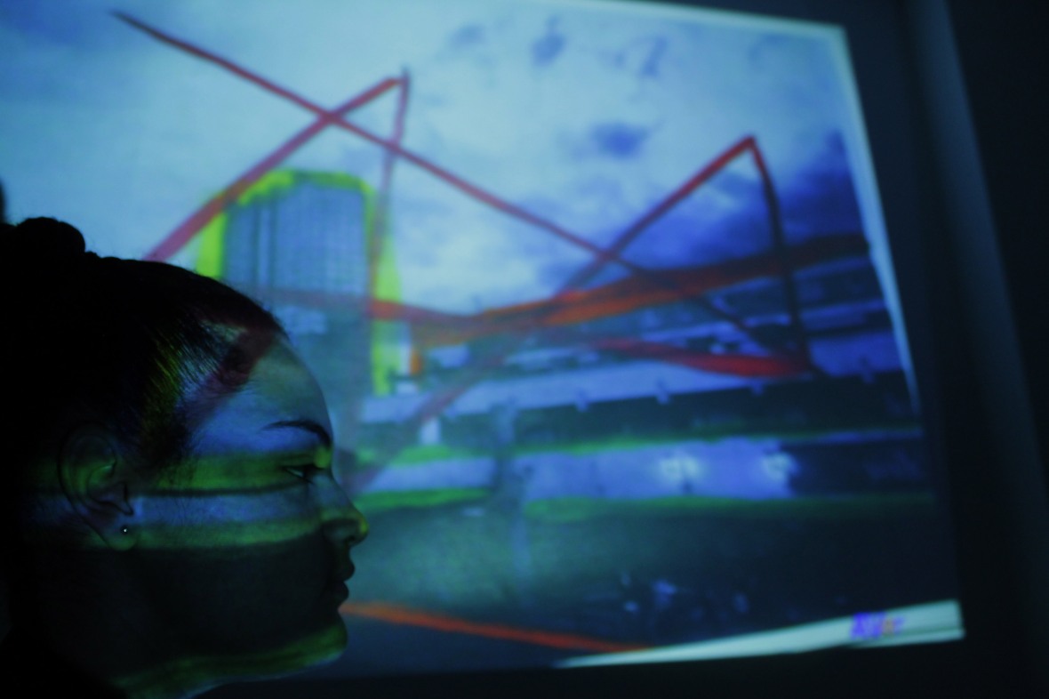
Development – Projection experiment
To experiment with my images I have decided to project my original images that I painted on and then got someone to stand in front of the projector so it shows their face outline in front of the visualizer. I did this to try a new technique and also I wanted to make it more similar to Polke’s art piece and actually involve peoples faces since the meaning behind all my responses is issues and problems people have created and caused and so I wanted to capture images of them looking and standing in front of the issues.
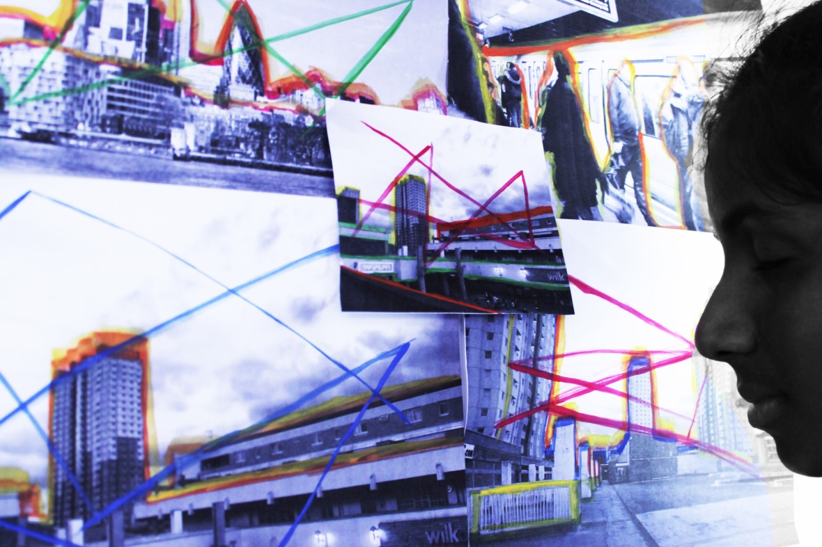
Contact sheet:
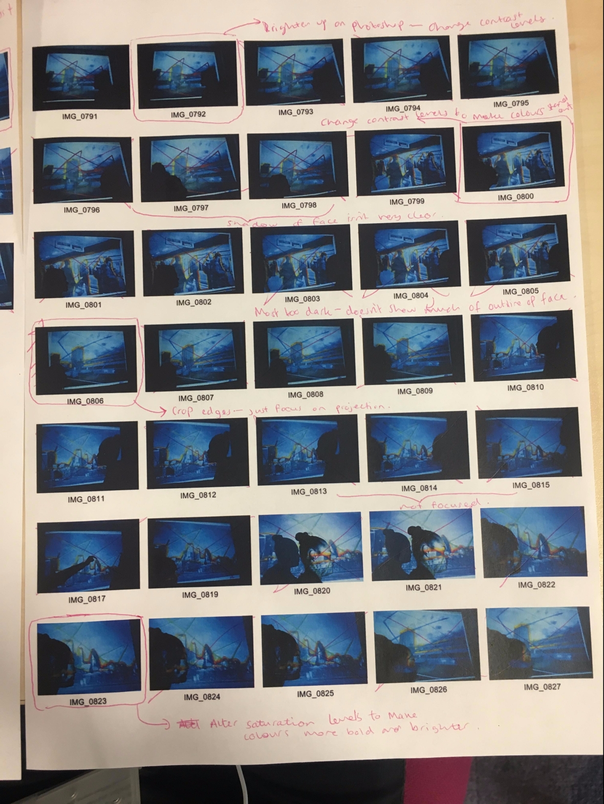
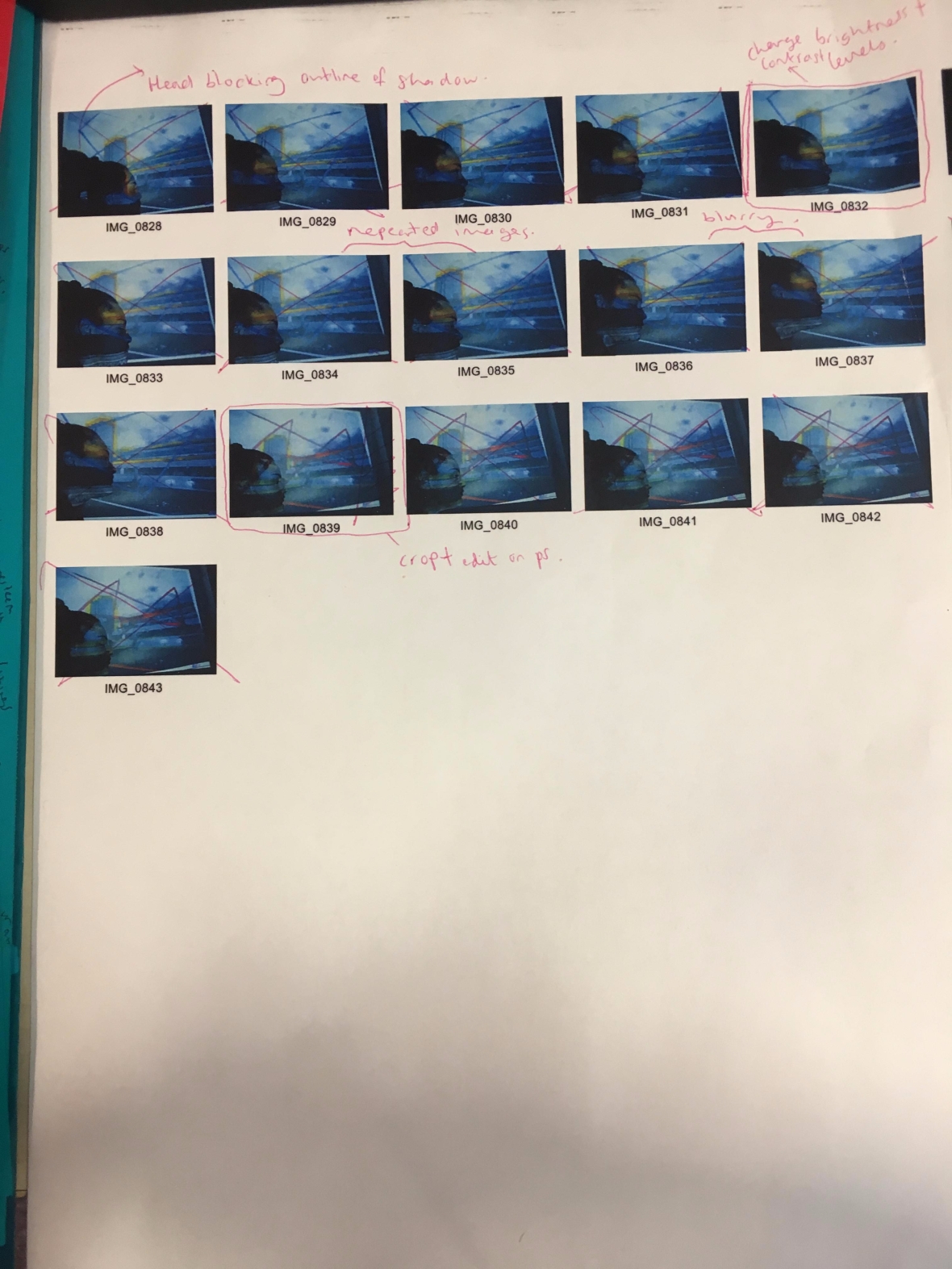
As I was picking my final images to work on I noticed that most of the images I didn’t choose failed because I took some of the images at awkward angles and so their head and the shadow of their head from the projector covered up most of the wall where the painted images were being visualised on and so it was hard to find the right balance of the persons head and the paintings in the background. Also some of the images came out too dark and you couldn’t really see the images in the background.
Final images:
Evaluation:
When I was first given the theme of ‘Evidence of a human presence’ I created a mind map and wrote down different ideas. The idea that I decided I wanted to develop was focusing on the problems and issues humans leave behind on the earth. When researching into this problem I noticed that pollution is a big issue and there are different factors that contribute to this such as: transport, buildings and litter. All those different factors are all things created and caused by humans which then explains how my response links to the theme as pollution is evidence that humans exist. To add more research into my response I researched what buildings in London have produce high pollution rates and it said the buildings in central London, especially near London Bridge create a lot of air pollution which is why for one of my photographs I decided to capture those buildings.
The first artist I looked at that inspired me to start my response was Joseph Mallord William Turner; his piece of work was a painting of a train. In this painting there was a blur and cloudy effect from the brush technique he used when painting this and he made the object (train) focused but the background quite blurry. This linked to my own response and research because as I am focusing on pollution and the problems humans leave behind and so I wanted to use the technique of blurring my images and the background to represent pollution as most times it is not visible. Another artist I used for the blurring technique was Ernst Haas. Since I was taking photographs of the different factors of pollution and people was one of them I decided to look at Haas’ work because most of his work he captures the movement of people which creates a blurred effect.
For different techniques and colours when editing my images I researched and looked at artists such as Rodney Graham –he uses a cut up technique, where he takes images and then cuts them up into sections. Miles Aldridge – he uses bright bold colours in his photographs which make his images look quite crowded and busy from all the bright colours he uses which can sometimes clash. Pierre Huyge – he takes photographs and then edits them to make then look quite gloomy , foggy and dark by using dark blue/ grey tones. Then the last artist I looked at was Sigmar Polke – he uses a painting technique with shadows; he takes photographs of a place or scene with a person’s face outline on the side and then paints over the image using bright colours to help them stand out. His work linked to my research by taking images of building’s and highlighting the outline of them with paint to show they’re a factor to pollution with a humans shadow in front of the paint images to show that humans are the cause and creator of the pollution.
Throughout this project I have used 2 lens based media; which are a camera and projector. I used the camera from my DLSR and my iPhone throughout this project when taking different images. I used the visualiser from the projector in my last response when I wanted to project my painted images onto the wall and use someone’s shadow in front of it and take a photograph of that.
To conclude this ‘Evidence of a Human Presence’ project I wanted to experiment with my images I have decided to project my original images that I painted on and then get someone to stand in front of the projector so it shows their face outline in front of the visualizer. I did this to try a new technique and also I wanted to make it more similar to Polke’s art piece and actually involve people’s faces since the meaning behind all my responses is issues and problems people have created and caused and so I wanted to capture images of them looking and standing in front of the issues.
